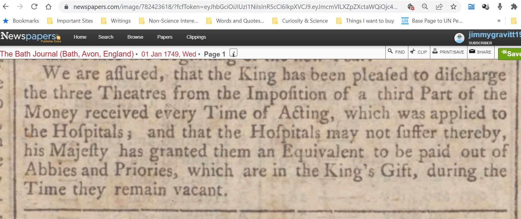
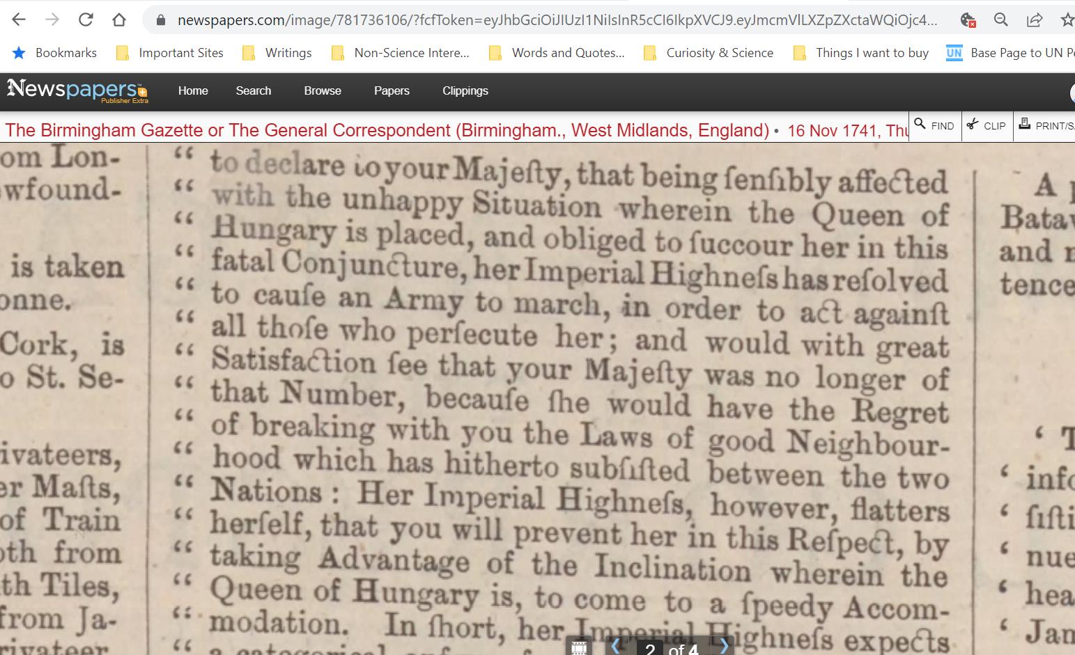
As Xanne notes in a comment beneath the posted question, the generic name for a joined two-letter typed character such as ct in the image above is ligature. Writing in response to essentially the same question in the Linguistics Stack Exchange, under the title "Diacritic connecting c and t," Alex B. offers this comment:
The most common way to refer to ct is either the ct-ligature or ligatured ct, which already implies presence/use of the connecting symbol, so really there is no need to have a special term for it.
Further, specifically with regard to the mark that physically connects the c and the t, Alex B. offers this note:
Sometimes it is referred to as a bow or a loop (e.g. the Chicago Manual of Style, 17th ed.). Descriptively, it is a semicircular stroke above ct.
Finally, Alex B.'s answer cites Albert Derolez,The Palaeography of Gothic Manuscript Books: From the Twelfth to the Early Sixteenth Century (2006) for the following information on the heyday of ct-ligature usage by printers:
The st-ligature was invariably employed, but a new variety of ct-ligature was introduced, which would last until the end of the Middle Ages. In many manuscripts the usual Carolingian form is found, in which the c is connected with t by means of a bow above the headline; this bow may adopt various shapes [cross-reference omitted]. ... In many books, however, there is no sign of this ligature and c is followed by the usual form of t [cross-reference omitted].
As suggested by Alex B.'s answer, The Chicago Manual of Style, sixteenth edition (2010), includes the following glossary entry for ligature:
ligature. A single character formed by joining two characters, such as oe, fi, or ff. Older, more decorative forms (such as ct—a c joined to a t by a loop) are known as quaint characters).
The name quaint character goes back more than a century, as we see in the list of "QUAINT CHARACTERS for use with Caslon Oldstyle No, 471" (which includes a ct-ligature), in Supplementary Catalogue: New Type Faces | Borders | Ornaments | Brass Rule | Produced by This Company Since the Publication of the American Specimen Book of Type Styles, 1912 (1917).
Likewise, Keith Houston, Shady Characters: The Secret Life of Punctuation, Symbols & Other Typographical Marks (2013) lists two forms of ct-ligature, along with ligatures for st, as, es, is, ll, ns, nt, sp, Th, tt, and us, under the heading "quaint ligatures." This is in contradistinction to two other categories of ligatures, which Houston identifies as "modern ligatures" (fi, fl, ffi, ffl, fb, fh, etc.) and "archaic ligatures" (ſ, ſb, ſi, etc.).
In any event, although Derolez says that ct-ligature "would last until the end of the Middle Ages," it clearly lasted longer than that. In fact, the Wikipedia article on Linux Libertine—described as "a proportional serif typeface inspired by 19th century book type and is intended as a replacement for the Times font family"—includes a ct-ligature. So strictly speaking, the ct-ligature was never universally used and has never entirely stopped being used.
To sum up, the general name for a combined two-letter character is ligature; the particular category of such combined letters that the ct-ligature falls into is quaint ligatures, and the connecting stroke between the c and the t in a ct-ligature is called a bow (by Albert Delorez) or a loop (by The Chicago Manual of Style).


