Approach to the Question
The question addresses historical changes in typesetting* conventions, particularly in Britain. The primary concern is spaces associated with the following punctuation marks: ? ! ; : (“ ” or ‘ ’), to which I have added the extra space associated with the full stop or point (.) which the poster does not mention, but appears in his example. The subsidiary questions are the style of the punctuation dash or rule and the choice of single or double quotation marks. I shall deal with these, but only incidentally.
*I use the term typesetting, rather than typography, because the question is mainly about the space between the type elements, rather than the elements themselves. Of course, the two are closely associated in the overall design of the page, and the choice of single or double quotation marks and the length of rules is typography.
Summary
Printed work from as early as Shakespeare until the middle of the
twentieth century was typeset in Britain with a space preceding the marks ? ! ; : and with two spaces following a full stop / period. A space followed the opening quotation mark and preceded the closing
quotation mark, and both single and double quotation marks were used, the latter being more common. Long dashes or lines without spaces were used for punctuation.
I would suggest two technical developments provided the conditions for the overthrow of the conventions of three centuries: the replacement of manual by mechanical typesetting in the late 19th century, and the explosion in publishing in the paper-back format in the first half of the twentieth century.
A landmark was the introduction of new house rules in 1947 by Jan
Tschichold at the Penguin publishing house, replacing the standard spaces associated with punctuation marks by thin and hairline spaces, the double-space following a full stop by a single space, and the long dash or line by an en-line with a space at either side. He also stipulated single, rather than double quotation marks.
By the mid 1970s the thin and hair space had generally disappeared at Penguin and elsewhere.
Other British publishing houses (some of which had already made departure from the older conventions), adopted these changes, although in a piecemeal fashion, and not in their entirety. (Thin and hair spaces were ignored or soon abandoned.) An example of such a historical development in a single general science journal is presented.
The single quotation mark has a long history, but was much less common than the double quotation mark until Tschichold’s making it Penguin’s standard. It probably now predominates, although the double quotation mark is still widely used in British publishing.
The spaced en- or em-line that differentiates British and US practice seems to be the one introduction that can be attributed to Tschichold and that transformed British style. Although the spaced en-line is still used by Penguin and others, some publications (The Financial Times for example) adopted and still use the longer em-line.
17th to 19th Century
The table below employed two online sources to examine original or contemporary editions of some classic works of literature. These were the British Library and Raptis Rare Books. Links are provided to allow the reader to verify entries in the table below.
EXPLANATION & KEY
The dates of original publication are given. ‘?’ indicates uncertainty whether the example is a first edition.
The presence of a leading or following space for the particular punctuation mark (as appropriate) is indicated by yes or no. A ‘—’ indicates the punctuation mark is not present in the page(s) shown.
qu = quotation marks (single or, in most cases, double), with yes indicating enclosing spaces.
ds = double space after a full stop / period. (Contemporary single space would be no).
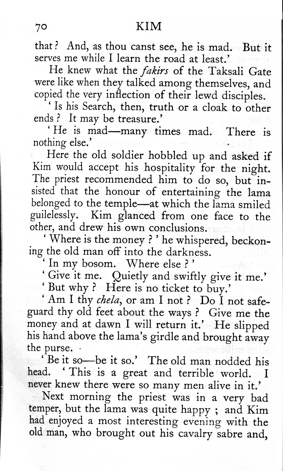
It can be seen that the additional spaces observed by the poster in his edition of Kim adhered to a long-established standard. The size of the spaces within quotation marks varied, and (as found subsequently) there was often less space left between the final stop and the closing quotation mark for optical balance. What was atypical of the time was the use of single quotation marks — almost all the other contemporary books I have examined used double quotation marks!
Jan Tschichold, 1947
The predominant historical style, described above, is to be found in all of the dozen or so hard-backed books I have inherited from the first half of the 20th century. Three examples of these — all from different publishers — are tabulated below. (Key as in previous table, but in this case the thinner hair spaces are indicated.)
| Published |
Publisher |
Title |
? |
! |
; |
: |
qu |
ds |
| 1911 |
Everyman |
Crime & Punishment |
yes |
yes |
yes |
yes |
hair |
yes |
| 1927 |
Nelson |
The Mill on the Floss |
— |
yes |
yes |
yes |
hair |
— |
| 1947 |
Constable |
Wax Fruit |
yes |
yes |
yes |
yes |
hair |
yes |
Although examples of more modern typsetting are to be found in this period in paperbacks and periodicals, I shall defer discussion of them until after describing the changes introduced by the German emigré designer and typographer, Jan Tschichold, when he was given free rein by Penguin to redesign their paperbacks. These are documented in his “Penguin Composition Rules” 1947, relevant extracts of which I quote from the volume Jan Tschichold, A Life in Typography by Ruari McLean (Lund Humphries, 1997). (The numbering of the ‘rules’ is mine, so I can refer to them.)
“All major punctuation marks — full point, colon… should be followed by the same spacing as is used throughout the rest of the line.”
“If this can be done on the keyboard, use thin spaces before question marks, exclamation marks, colons and semi-colons.”
“Instead of em-rules without spaces, use en-rules preceeded and followed by the word space of the line…”
“Use single quotes for the first quotation and double quotes for quotations within quotations.”
“Opening quotes should be followed by a hairspace, except before A, and J. Closing quotes should be preceeded by a hairspace except after
a comma or a full point.”
Thus:
Rule 1 eliminated the double space after full stop.
Rule 2 eliminated the full space after the punctuation marks shown in the table.
Rule 3 introduced a completely new style for rules, which has become distinctively British.
Rule 4, although with historical precedent, rejected the predominant contemporary style.
Rule 5 eliminated the full space inside quotation marks.
Penguin Books was established in 1935, and I can only find a couple of pre-Tschichold examples in our collection. With this disclaimer, I present the table below as example of ‘before’ and ‘after’:
| Date |
Author |
Title |
? |
! |
; |
: |
qu |
ds |
| 1940 |
David Low |
Europe since Versailles |
— |
— |
yes |
— |
yes |
yes |
| 1950 |
Ivan Turgenev |
On the Eve |
yes |
yes |
thin |
thin |
no |
no |
| 1954 |
Josephine Tey |
The Daughter of Time |
thin |
thin |
thin |
thin |
hair |
no |
| 1956 |
CP Snow |
The Masters |
thin |
— |
thin |
thin |
no |
no |
It should be mentioned that only the 1940 text had double quotes, and the three later ones had the spaced en-rule.
Early 20th Century Developments before Tschichold
As already mentioned, changes in typesetting were occurring in the early 20th century before 1947, perhaps influenced by the introduction of paperbacks and by the demise of manual typesetting. Indeed in Penguin itself, different styles were to be found — I have a wartime edition of Thornton Wilder in modern US style.
However examples of a move to a more compact style, as regards space, can be found in designers of quite a different philosophy from Tschichold, who had worked at the Bauhaus and published a declaration that the only modern typefaces were sans serif faces. These were the members of the Arts and Crafts movement, who certainly rejected modern mechanical typography. Thus, in John Ruskin’s The Nature of Gothic, despite imitatiing a page of an illuminated manuscript, one can clearly observe only single spaces after a full stop, and hair spaces before a semi-colon. In a similar vein, my wife has in her possession a small hard-backed lace instuction book published by Dryad Handicrafts in 1928. It is replete with anachronistic st and ct ligatures in the body text, but nevertheless has abandoned spaces within quotation marks (double, incidentally) or before semi-colons or question marks.
Influence on other Publishers and Further Evolution
I am unable to document the changes in other paperback publishing houses, but the small sample from the fifties and sixties shown below indicates a change from the traditional typesetting was occuring then. The single quotation mark was not found in any of these four, and the abandonment of full spaces did not necessarily go via thin and hair spaces.
| Published |
Publisher |
Title |
? |
! |
; |
: |
qu |
ds |
| 1953 |
Pan |
The Man in the Queue |
thin |
yes |
— |
yes |
no |
no |
| 1961 |
Faber |
The Inheritors |
no |
no |
thin |
— |
no |
no |
| 1963 |
Fontana |
The Leopard |
thin |
yes |
no |
yes |
yes |
yes |
| 1966 |
Panther |
Our Lady of the Flowers |
no |
thin |
no |
no |
no |
no |
Indeed, Penguin itself abandoned thin and hair spaces in the 1970s — The first part (The Great Fortune) of the 1974 edition of Olivia Manning’s Balkan trilogy retains all the thin spaces, the second part (The Spoilt City), lacks some before question marks but retains others, whereas in the third part (Friends and Heros) none remain.
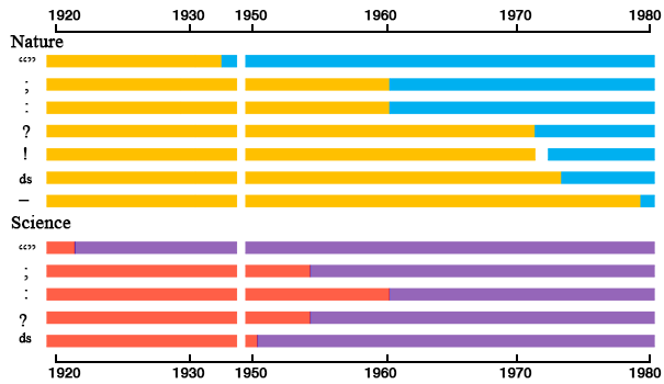
As a more scientific approach to the development of typesetting in Britain in the 20th century, I examined a single publication: the weekly general scientific journal, Nature, published by Macmillan for the period in question. All issues of the journal are available in the archive as scans of the originals if you have access through a University library etc. The graph below shows that after the early abondonment of spaces within quotation marks, changes occurred in four distinct phases between 1960 and 1980, when the unspaced rule was finally adopted, albeit as an em-rule, rather than an en-rule. (Images and examples of em- and en-rules can be found in this answer to a question specifically on such rules, which I have recently updated in light of Tschichold’s description.)

Yellow and orange represent the traditional typesetting, blue and purple the modern typesetting, as described above. The graph for Science lacks the rule, as it did not change, and information for the exclamation mark, which is uncommon in the publication.
Our American Cousins
It is hardly surprising to discover that 19th century typesetting conventions in the US were similar to those in Britain, as these continued the tradition current at the time of colonization. This is illustrated by pages from the first edition (1882) of Mark Twain’s The Prince and the Pauper, viewable on the website of an auction house at the time of writing.
I am not able to say when the punctuation spaces disappeared from books published in the US (certainly by 1970 when I lived there). An auction-house 1932 first edition of Hemingway’s “Death in the Afternoon” has lost the double-space following a period, but retains a thin space before a colon or semi-colon. I leave a more extensive investigation of books to others, but was able to perform an analysis using the archive of the US journal, Science, similar to that for Nature (above). It can be seen that the transformation was earlier in the US, but occuring after 1950 for the most part.
To what extent changes in the US were influenced by changes in Britain is unclear. It seems unlikely that Tschichold was influenced by American practice as his immediate background before coming to Penguin was in Switzerland, working in a language, German, with quite different typesetting conventions.


