1

Let me first explain what CSS floats are.

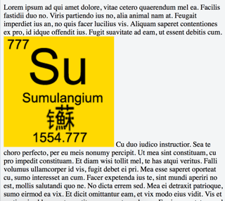
Normally, without any floats, text and image look like this:

enter image description here

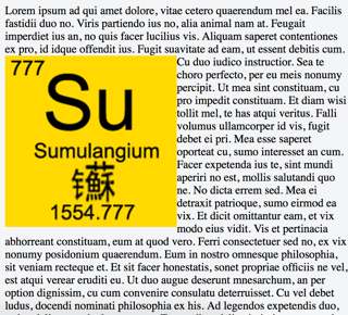
If the image is floated left, it looks like this:

enter image description here

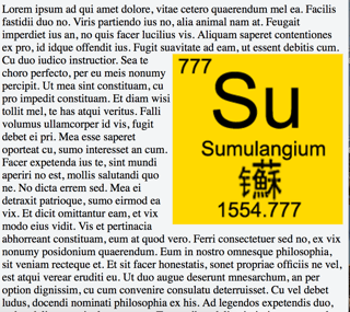
If the image is floated right, it looks like this:

enter image description here

When there is a float, the text will wrap around the image.

In my app, I want to give users options to set the style they want. I want them to choose from the above three styles. But I don't think ordinary people understand what CSS floats are. So I guess I need to express this idea in a more colloquial way. Currently, I have these in mind:

  • Text not wrapping image
  • Text wraps image, image on the left
  • Text wraps image, image on the right

I think they are too long. Is there a more concise/colloquial way to express these?

5
  • "The image doesn't push the text all the way down, leaving a bunch of blank lines. Instead, it sits next to the words, like a picture in a textbook" Commented Jul 2, 2016 at 10:25
  • Don't you think that's even more verbose than what I had? I want a more concise one. @NickWeinberg
    – Sweeper
    Commented Jul 2, 2016 at 10:27
  • You are right, but I can't picture most of my co-workers understanding the idea of text "wrapping around" anything; I was providing a possible alternative wording that doesn't use "wrap" Commented Jul 2, 2016 at 10:32
  • What benefit would not using text wrapping offer to the user? I think most people that wouldn't understand the text-wrapping concept will think the non-wrapped page is broken or designed improperly. Commented Jul 2, 2016 at 13:06
  • How about? 1. Text sits above and below image 2. Text surrounds left-handed image 3. .. right-handed image.
    – Mari-Lou A
    Commented Jul 9, 2016 at 11:01

4 Answers 4

1

The wording that you choose needs to convey two key pieces of information in each instance: (1) the location of the image relative to the column of text (in U.S. publishing terminology, the three usual options are flush left, centered, or flush right, where flush means "aligned with the specified margin"); and (2) whether the text wraps around the image or stops at the beginning of it and resumes at end of it, leaving open space next to the image (in U.S. publishing terminology, having the text reflow in what amounts to a narrower, customized column—or other shape determined by the image's shape and position on the page—next to the image is called wrapping).

The OP lists three suggested wordings for these relationships of image and text on a page:

  • Text not wrapping image

  • Text wraps image, image on the left

  • Text wraps image, image on the right

The second and third suggestions identify the two pieces of information that I said were necessary from a design/publishing perspective, but the first of the three does not—because it doesn't specify where the image should fall with respect to the left and right margins of the page or column.

In U.S. publishing terminology that I've seen used, the three options might be described as follows:

  • Image flush left; no text wrap.

  • Image flush left, with text wrap.

  • Image flush right, with text wrap.

This abbreviated yet highly regimented wording style is not significantly shorter than the OP's suggested wording, but it is succinct (with no repetition of the word image, for example), it applies easily to all six standard combinations (including, for example, "Image centered; no text wrap" and "Image centered, with text wrap"), and it ensures that both key pieces of information get recorded.

If you're concerned that readers won't understand the meanings of flush and wrap, it may make more sense to provide brief definitions of the key terms (flush left, centered, flush right, and text wrap) in an introductory paragraph or mini-glossary, and then use the shorter forms consistently throughout the rest of the page. By the way, I've never encountered the term CSS floats before— presumably because I've worked on the editorial/design side of the process rather than the CMS/app dev side—but if you think that including a carefully worded definition of that term might help ordinary people understand its meaning and relevance, you can certainly add one.

1
  • I should point out that some U.S. publishers prefer the term justified to the term flush, yielding the expressions left-justified and right-justified.
    – Sven Yargs
    Commented Jul 15, 2016 at 7:07
0

I think it is hard to communicate even one option using words only. My generic non-language advice would be to allow your user to play with the options a bit before deciding properly. But this is a language Q&A. So here goes:

  • Text not wrapping image
    ->no flow or plain vanilla
  • Text wraps image, image on the left
    ->text flows around the right
  • Text wraps image, image on the right
    ->text flows around the left
0

My suggestions are (in the same order):

No text beside the image

Text on the right of the image

Text on the left of the image

I suggest you also include the images provided in your question, if its not too hard. They say a picture is worth a 1000 words.

0

I think you need to get away from words like 'flow' or 'wrap' used by css, and use more everyday words instead, even if they are less precise. For example you could use "surround":

  1. Image on left surrounded by text.
  2. Image on right surrounded by text.
  3. Image without text either side.

You could argue that 'surround' implies every side, but the phrases I have suggested would be clear to users.

You must log in to answer this question.

Not the answer you're looking for? Browse other questions tagged .